
About This Project
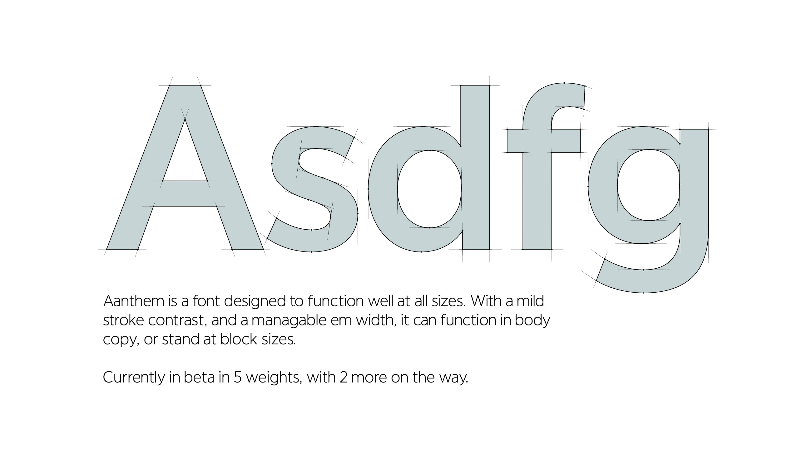
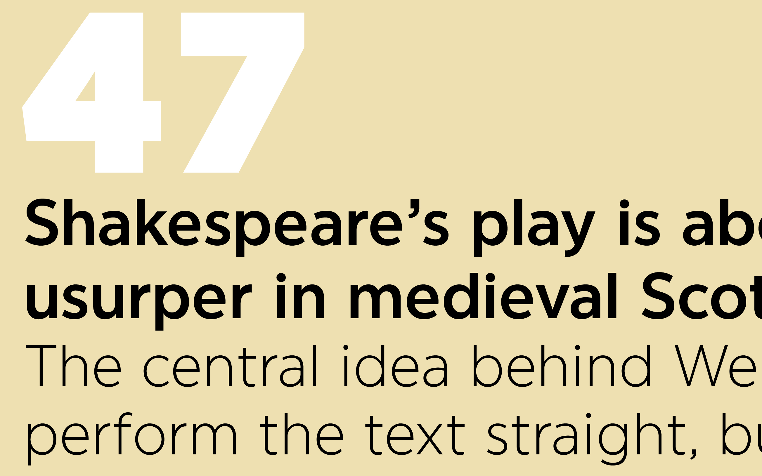
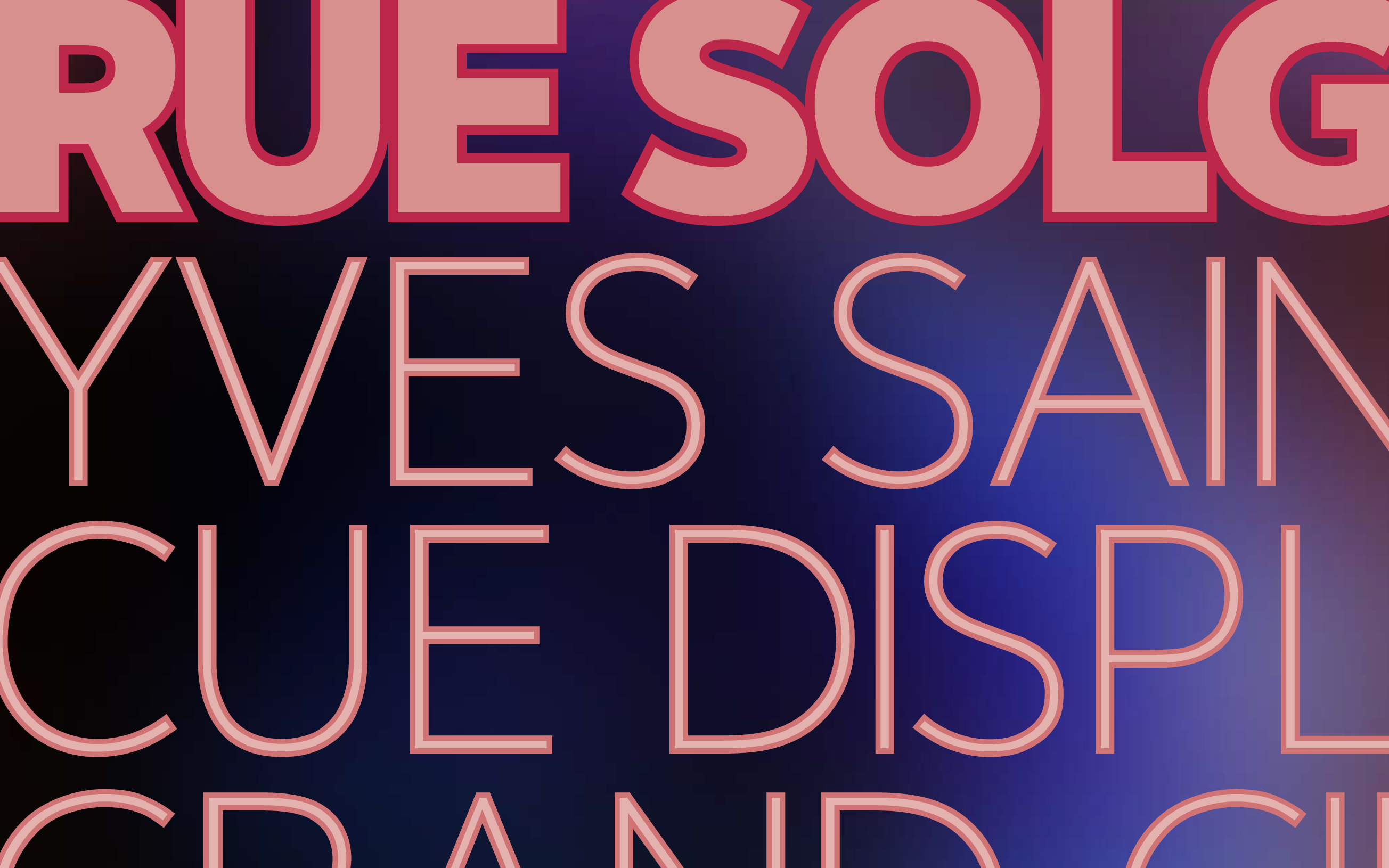
I pulled inspiration for Aanthem from the faded hand-painted signs you can still find in old industrial neighborhoods of NYC. Wide/circular/painterly fonts don’t work well in body copy; but I wanted to see if I could make a font that breaks this rule. I wanted something so functional and beautiful it would work in both large sizes and block text. The approach was to develop curves that maintained a circular visual impression, yet kept the em width manageable to achieve nice ragging in body copy.
My personal preferences in font design tend towards lower stroke contrast and simpler curves with every extra detail stripped away. Yet these preferences were perfectly in line with what the font itself demanded. A font knows exactly what it wants to be, with every detail self-evident and inevitable. I don’t feel I designed the font, so much as I uncovered it.
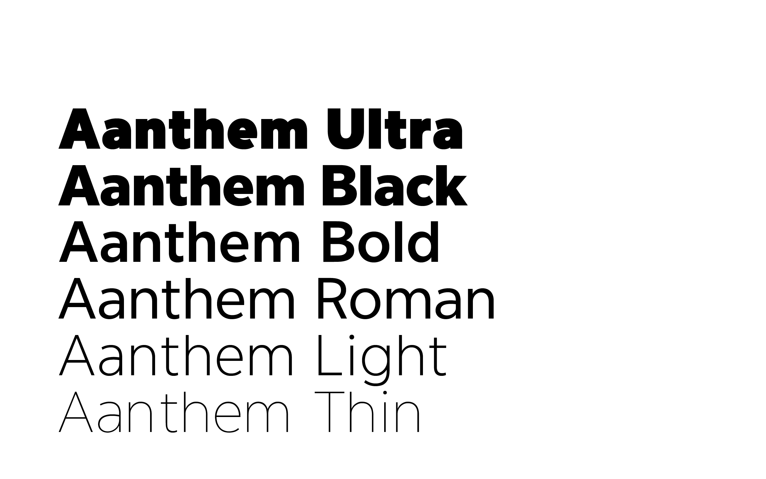
Aanthem is drawn in Illustrator and coded in Fontlab Studio. It is currently in beta in 5 weights (with 2 more on the way!) and represents a passion project of over 4 years.
