About This Project
In pursuing an AOR extension with a long-term client, I grounded the strategy in what already differentiated the relationship: years of shared history, deep category knowledge, and trust earned through execution. Because the scope was broad and ongoing, the focus was on winning on fundamentals rather than novelty.
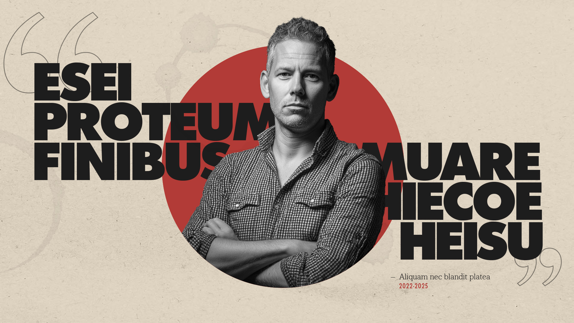
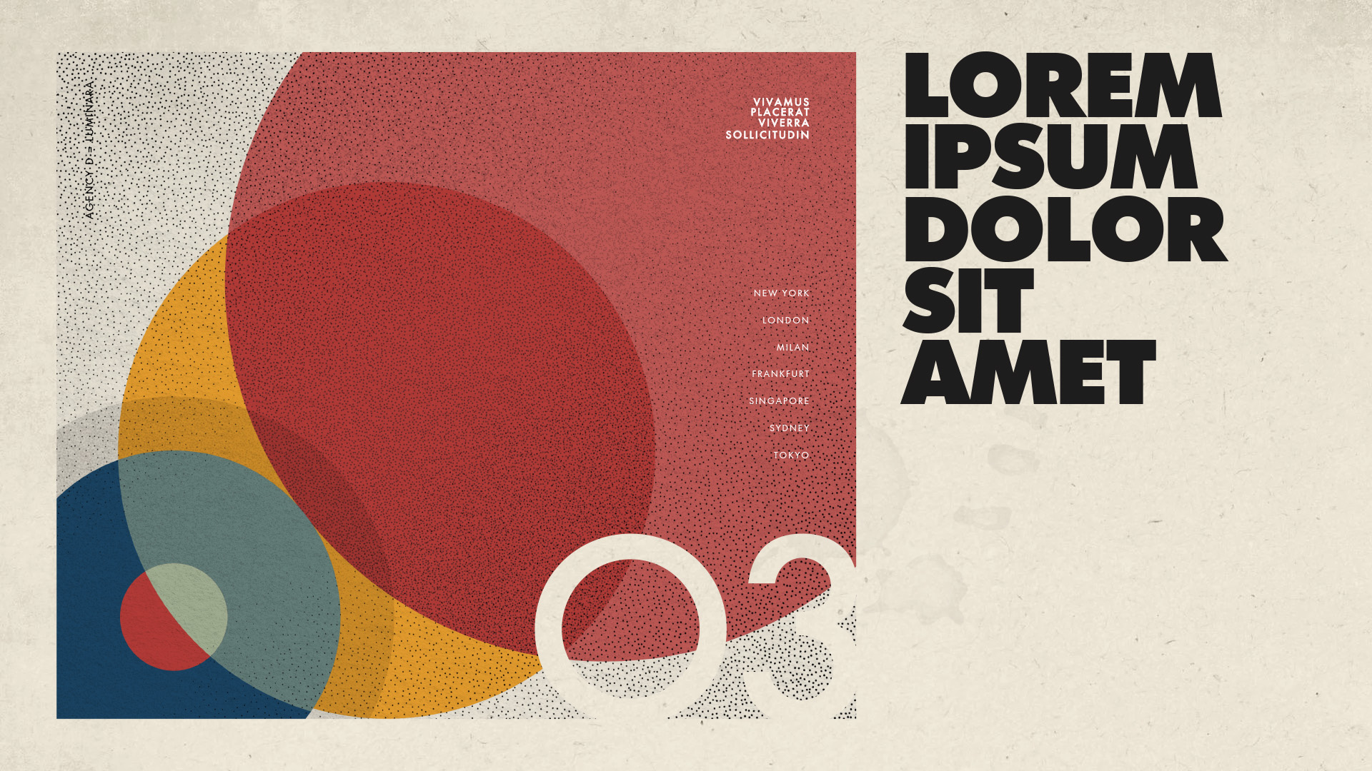
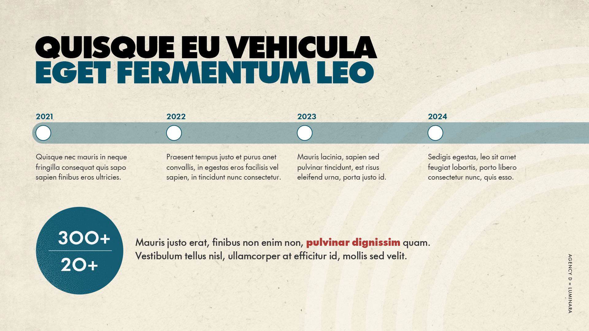
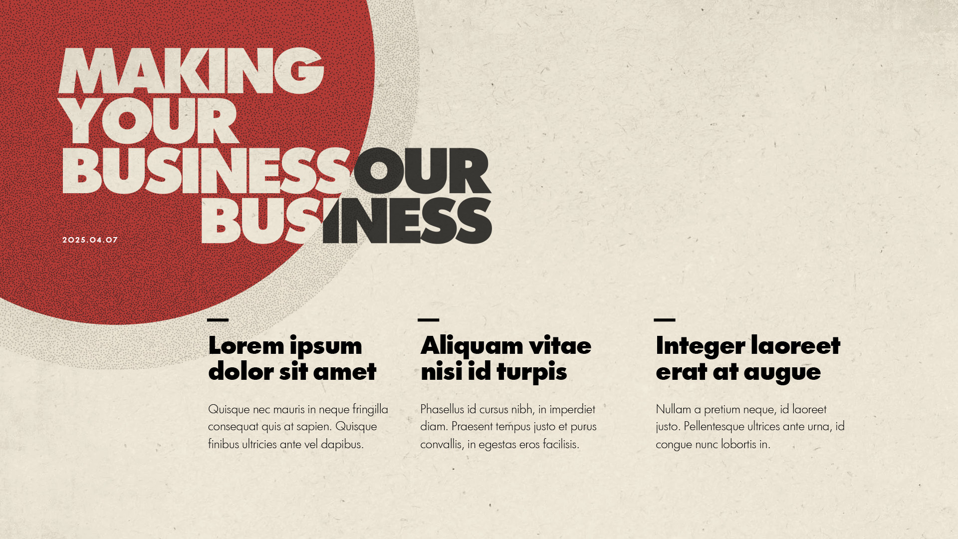
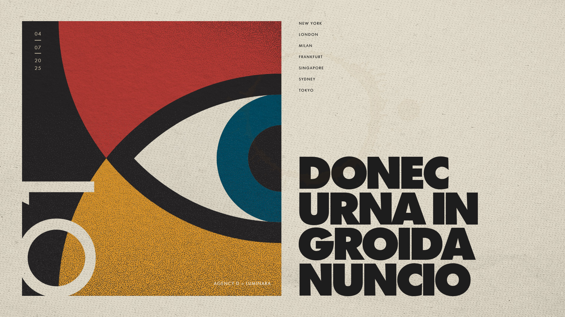
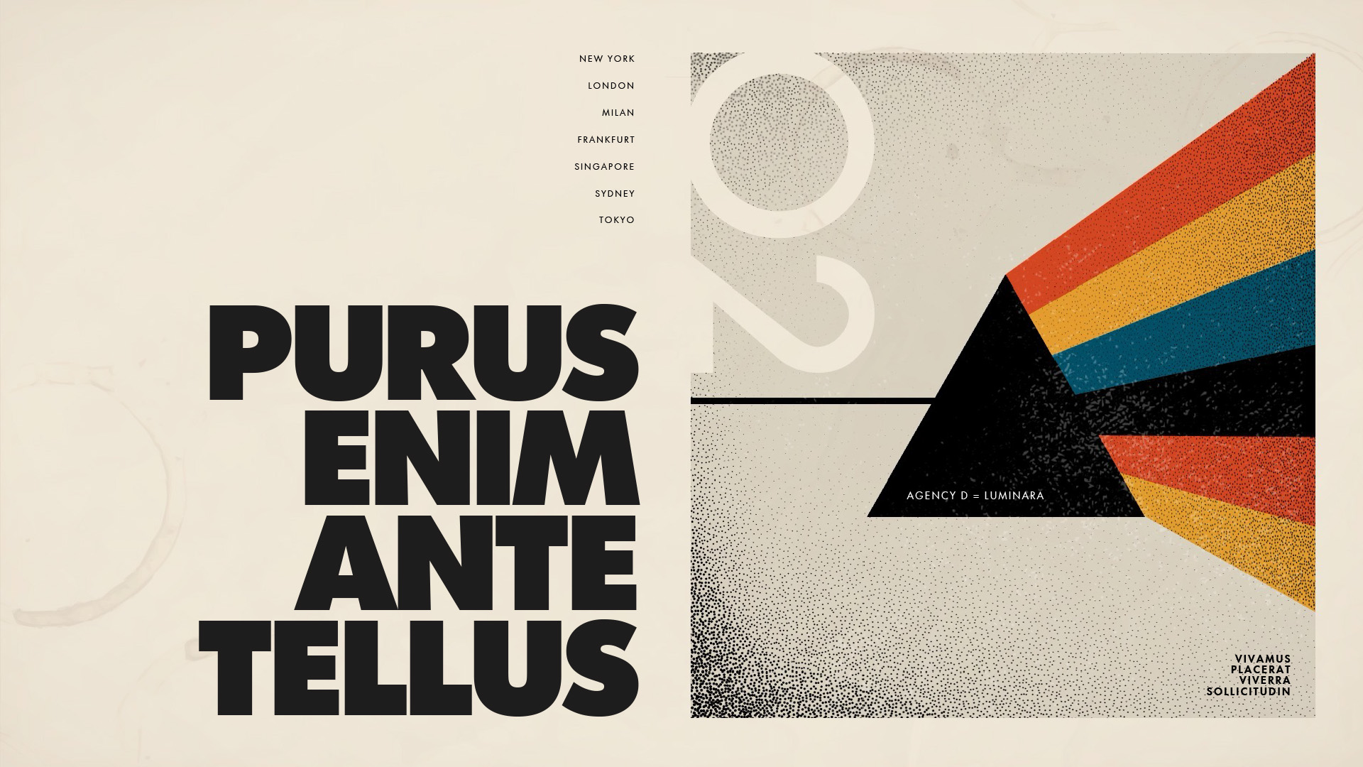
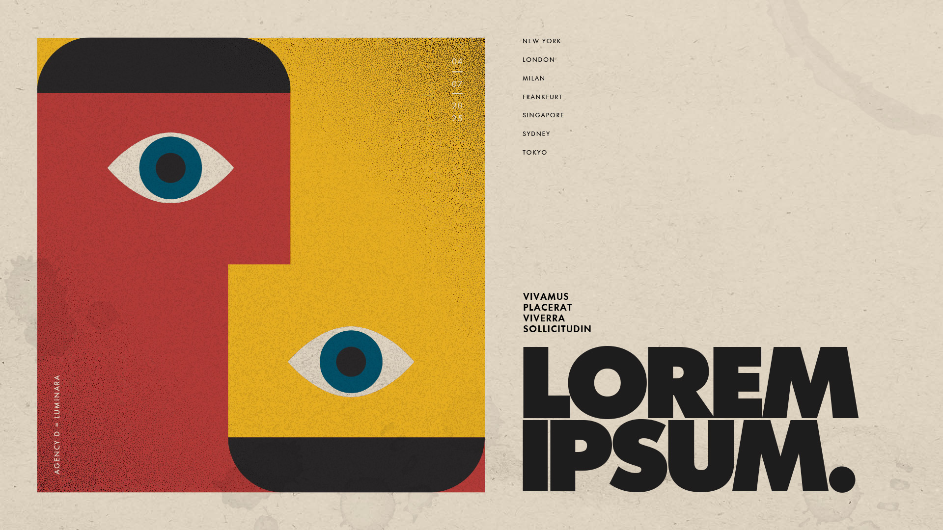
That thinking led me to a Bauhaus-inspired visual language—reinterpreted for the present day. Bauhaus represents clarity, craft, and enduring principles: form following function, precision without sterility, and design built to last. The organic textures and tactile, slightly distressed details were a deliberate counterpoint to generic “tech-forward” aesthetics, reinforcing a sense of human craftsmanship, materiality, and timelessness.
The result was a system that felt established but not dated—rooted in expertise, confident in restraint, and designed to signal a partnership built for the long term.